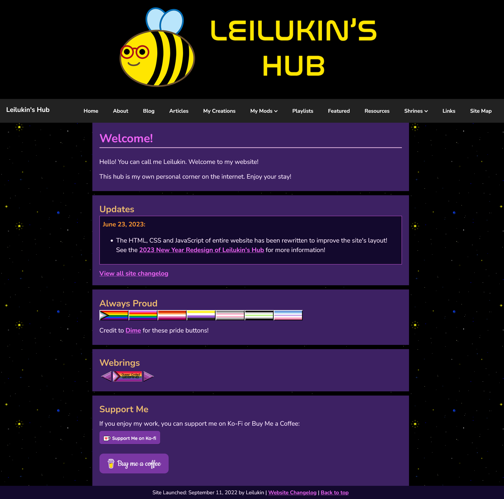
Happy Pride Month! It is always Pride on this literally queer-coded (as in, literally coded by a queer person) website, so Leilukin's Hub decided to celebrate Pride Month with a major update — rewriting the entire website's layout!
This new layout remains the same colour scheme as the previous one, which went live in January this year. The most noticeable change you would see in this new layout is the sticky navigation bar, a feature that previously only existed in my shrines. However, under the hood the HTML, CSS and JavaScript all have been rewritten from the ground up to optimise the site's layout.
Highlights of the June 2023 layout rewrite of Leilukin's Hub:
- A new navigation bar throughout the entire website, instead of putting links to this site's pages on the sidebar. The design of this navigation bar is inspired by the dropdown menu bar at the end of this article: 6 Best Practices for Building Responsive Dropdown Menus.
- Rewrite the HTML elements to improve the website's layout.
- Use a mobile-first workflow to rewrite the CSS of this website to make the website more responsive to various screen sizes (mobile, tablet and desktop).
- Streamline the CSS of the main parts of the site into one CSS file. The only pages that also have their own CSS due to unique elements with custom classes exclusive to the pages are my mod pages. The shrines still have their own CSS files, however.
- Use Andy Bell's modern CSS reset for the CSS of the entire website.
- The header, navigation bar and footer have their own scripts to dynamically render the content of these elements with JavaScript's
innerHTMLproperty. - Add a "Back to top" link to the footer to quickly scroll back to the top of the page you are viewing
Rewriting the layout of this entire website has taken me many hours on this site redesign. Nevertheless, I am very pleased with how it turns out. Enjoy!
- Previous Post: Onboard the Dracula Daily Hype Train
- Next Post: My First Birthday After the Launch of Leilukin's Hub
